
Rebrand
Vertus
About
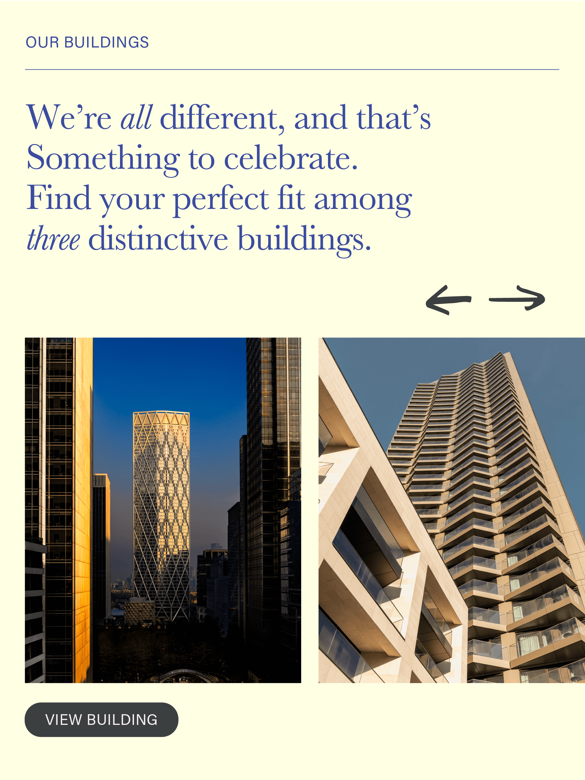
Vertus, Canary Wharf's 'Build to Rent' offer, was first opened at a time when the area was known as London’s financial district, and the brand reflected that—corporate, monochrome, and lacking warmth. Today, Canary Wharf has evolved into more than a business hub. It’s a lively destination to live, visit, explore waterways and experience culture.
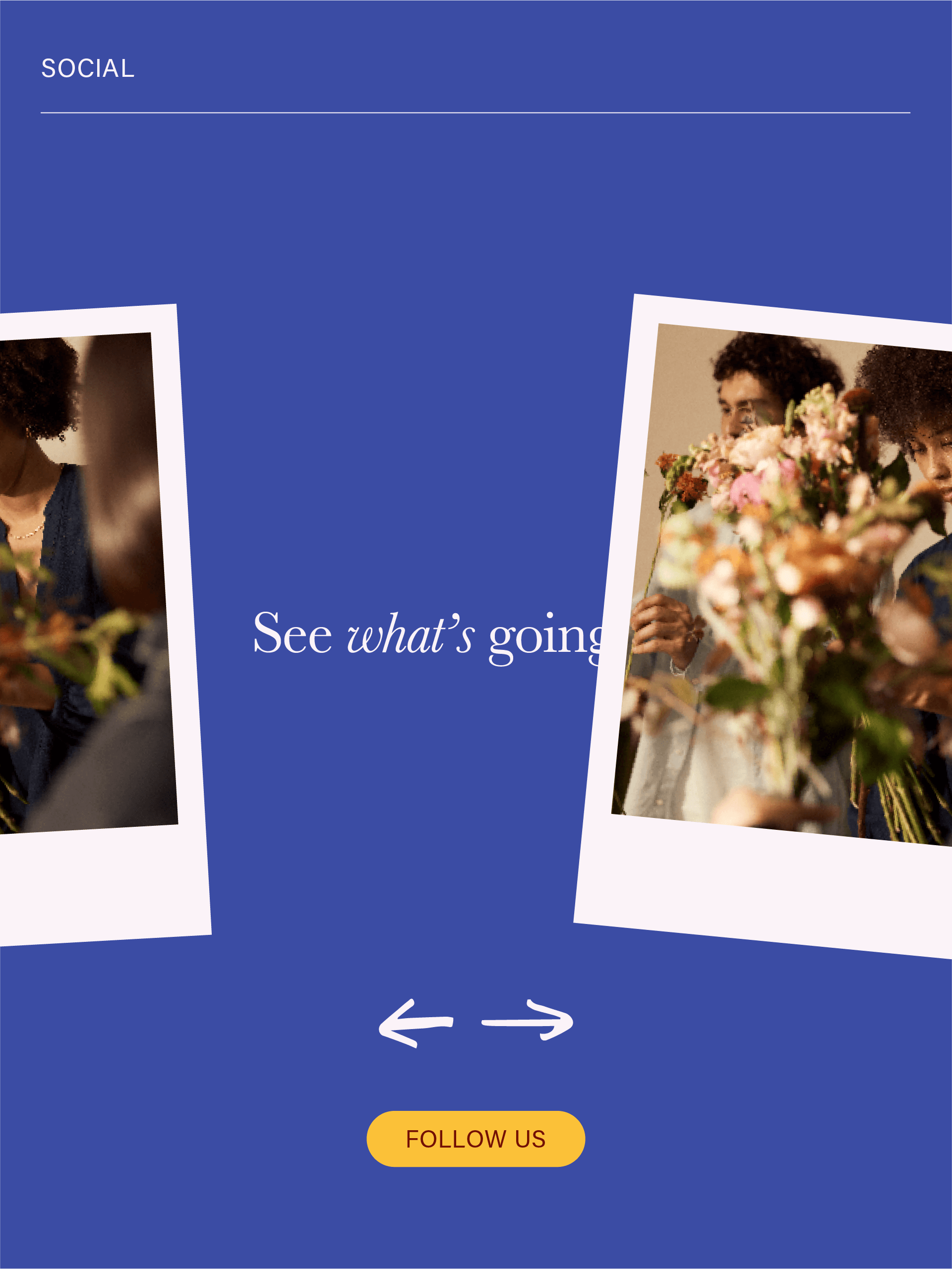
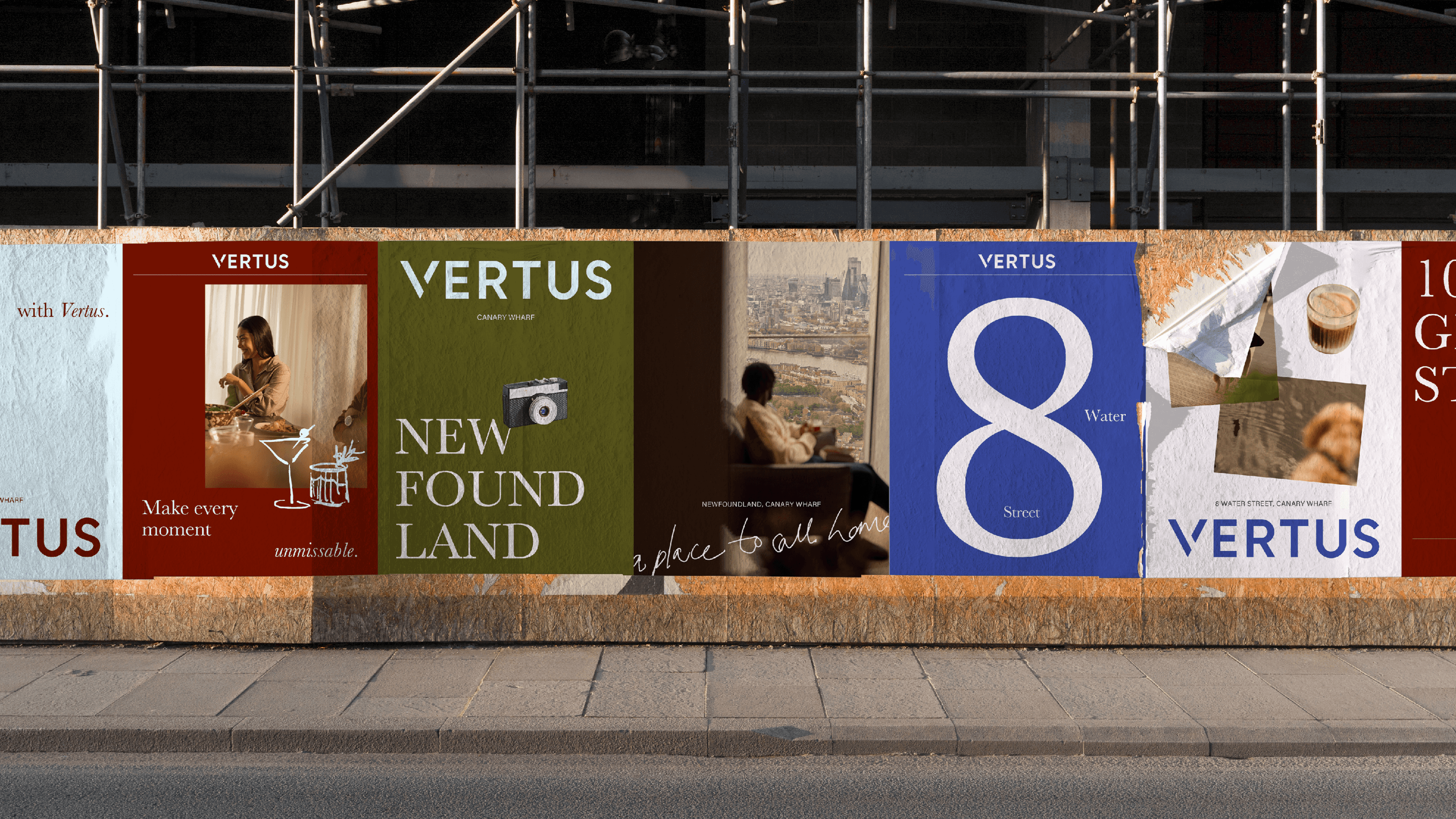
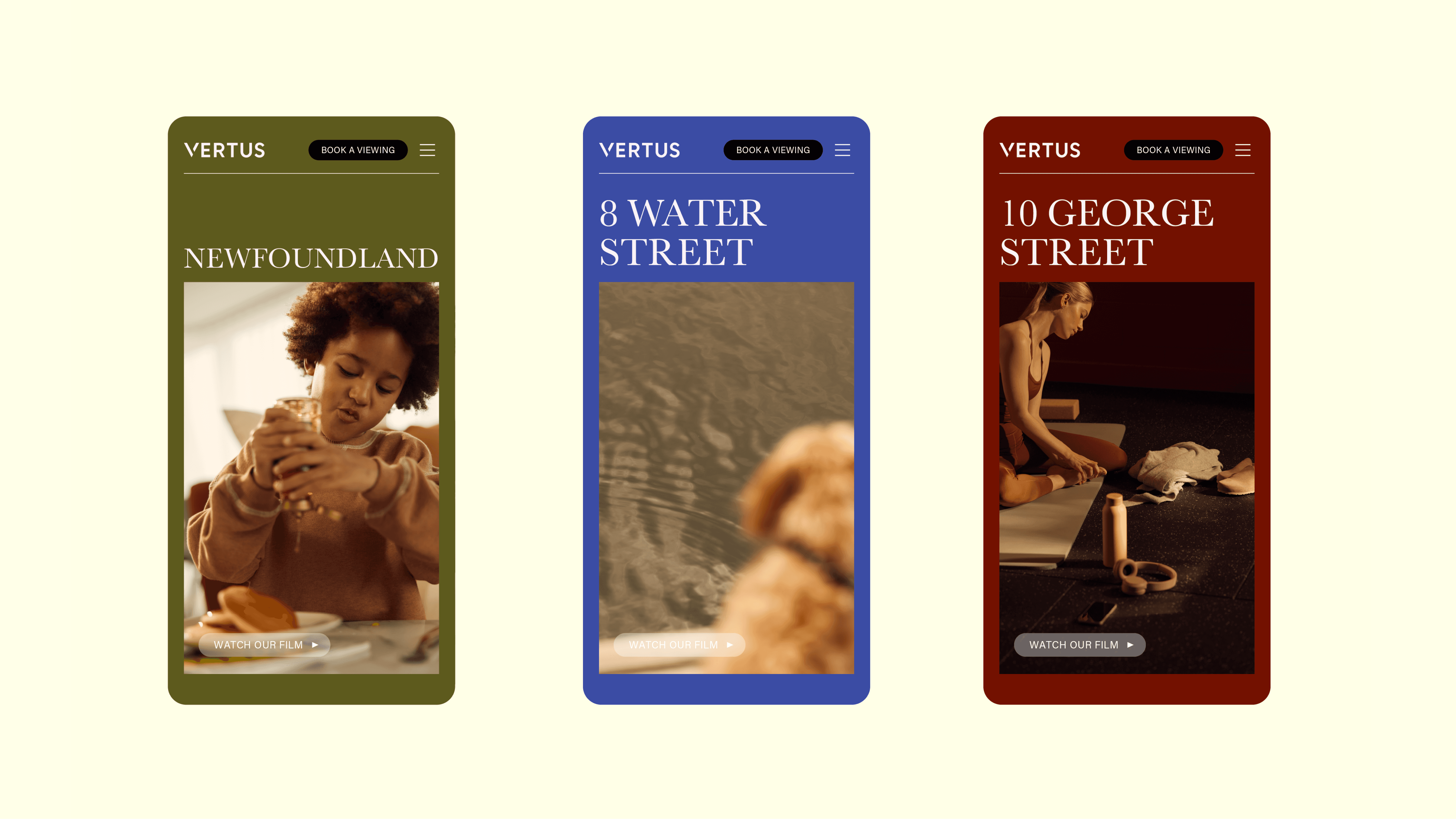
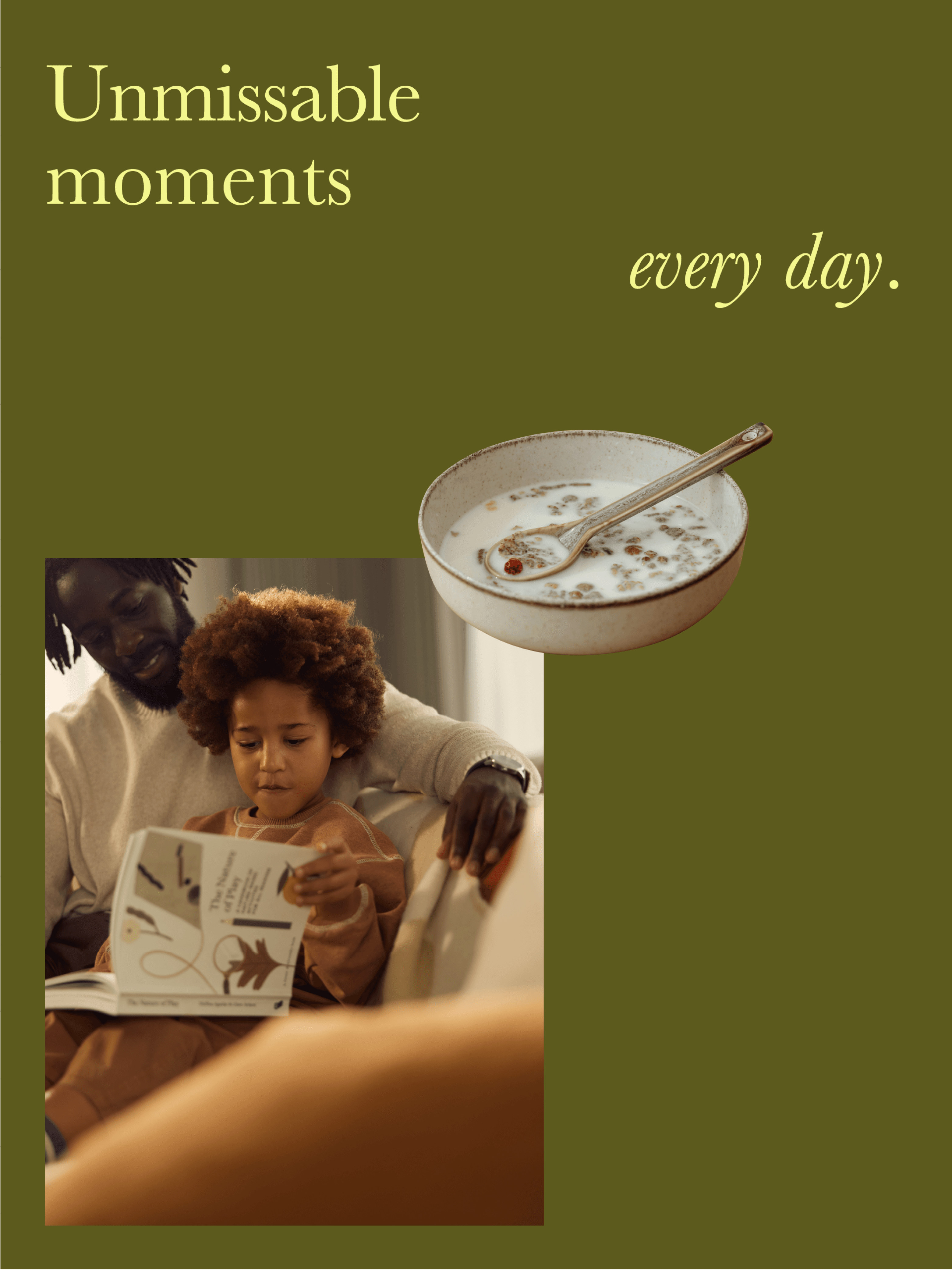
CWG requested a complete rebrand, including strategic positioning, tone of voice, and visual identity. Drawing inspiration from the strong friendships formed by residents and staff alike, we repositioned Vertus as a ‘close friend’. The system, inspired by a journal, features hand-drawn elements, scrapbook-like cutouts, and scattered intimate photography to evoke a ‘human touch’, bringing the warmth the brand needed to truly reflect the Vertus experience.
Client
&Dave, for CWG
Deliverables
Brand Identity
Art Direction
Digital
Social
OOH
My role
Creative Direction
Art Direction
Design


Contact
Sitemap
Follow
JPOD LTD
Company No. 13491519